B&H Value Proposition - Problems and Process Overview
Create a design that increases the sites credibility, trustworthiness and awareness of who B&H is.
3 months from research to finished design

Research the issue

Understand the user

Design solutions

Test, iterate, test again
B&H Value Proposition - Problems and Process Detailed
Do customers understand what B&H does and what it sells. Is the site trustworthy?
The problem
Based on some surveys, our credibility and trust seemed to have dropped. We wanted to learn if by adding a humanized value proposition to the homepage can we regain trust from our customers.
We first did a some exploratory research on Value propositions and at the same time some homepage comparative studies to ABT, a similar electronics store. After reviewing the research on the homepage, many users thought B&H was a bidding site like eBay and did not trust the site.
What we want to learn
Does adding some history and personal stories create more trust with the brand.
How does the changes affect the objectives? (e.g. Engagement & Add to Cart)
Does the Youtube Video - Play negatively affect other objectives?
Does the inclusion of Employee stories negatively affect other objectives?
Does the Learn More Buttons negatively affect other objectives?
What I did
I was originally responsible for the exploratory research on Value Propositions that was presented to Senior Management. I participated in the brainstorming sessions, stakeholder interviews, Developer collaborations. I worked with the Creative Director to come up with different versions to A/B test.
Key tools and deliverables
Invision
Sketch
Usertesting.com
Full Story
A/B Test
Customer reports
Sales Reports
Surveys
Leading Metrics
Engagement: Search, Category, Listing, Detail, Sessions/Visits
Lagging Metrics
Average Order Value, Conversions
Results
The engagement in Var B. saw greater lifts throughout the conversion funnel. However, we saw minimal interaction with the History Video, and clicks on Learn More. Granted, we did see a lift of +16% of users visiting the About us page, and +16-17% lifts in scrolls on the page.
Equally important, we saw a -4% drop in bounce rates for this Variation.
We saw a slight increase in users engagement with search, listing, detail page, cart page and time on site. This may indicate more trust in the brand.
B&H Value Proposition - Research
What we did: Exploratory Research
One of the main things that stood out was a lack of who we are and how we represent ourselves on the homepage. Creating a Value Proposition Canvas really helped define our value to the consumer compared to big box stores.

One of the first things I did was to look at past surveys done by B&H to come up with a list of how customers characterize the brand in 3 words based solely on the homepage.

Next was to make an analysis of what B&H offers as a value proposition compared to six our biggest competitors.

From the excel sheet and the survey, a Value Proposition Canvas was created to see the overlap between what we offer that is unique and what our users want.
When the research was finished, it was presented to the stakeholders and management and as a guide to help us figure out the next steps.
What we did: Comparative Research
While working on the Exploratory Research, we also ran a user test comparing our home page to ABT, a similar sized electronics retailer to see how we stack up.

When we asked “State one word to describe how the B&H homepage makes you feel.” The sentiment was the page was cluttered and overwhelming.

When we asked “After exploring the Homepage entirely, what are your impressions?” The comments were overwhelmingly negative and confusing.

When asked “What did you feel was missing from the B&H homepage?” It wasn’t that there is something missing as there is just too much.
The take away is too much information, rather than missing information. The users felt the site was cheap and was more like an auction site.
B&H Value Proposition - Prototype
What we did: Applying the exploratory research and comparative research to the design
Based on the feedback we collaborated to make a few sketch and then created high fidelity screens to establish a realistic experience to encourage useful user feedback when we ran the A/B tests again.

Based on the research and stakeholder meetings, we created a design that shows what makes B&H different from other stores and explains who we are. B&H is a company that has been around for a long time with proven track record and great customer service.
B&H Value Proposition - A/B Test Results
What did we learn?

What stood out initially
✓ Employees & History / Professional & “in good-hands”
✓ Clean, fresh, minimalist
X One-note (green)
X Disorganized
Overall Clarity of content:
✓ Top Navigation and Featured categories are easy to comprehend
✓ Users notice more information like articles, cash and carry, and credit card/financing.
X Some interpreted our experts as existing customers – unsure who they are
X Text and logos are hard to read for some
Trustworthiness
✓ Employees convey a feeling of “home”, trustworthy, mom and pop store (not big box store)
The modernization, focus on employees and our history excites users.
Quotes from users
It made me comfortable buying products from real people.
I dislike the color scheme, lack of products displayed, and deals are hard to find.
B&H Value Proposition - Redesign and Test
What we did: Applying the lessons from the first homepage prototype vs the current homepage User Test
While the feedback was better from a user stand point, there was still room for improvement. We were able to take this feedback and discuss it with the stakeholders and convince them that less was more. From that meeting we were able to really minimize the value proposition and run another A/B test.
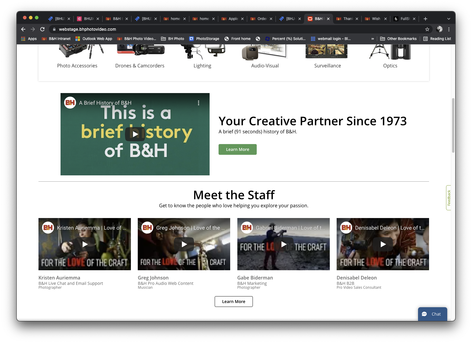
The Value proposition has become just a video about the history of B&H and instead of generic images of customer service people, we replaced it with videos of people who work n our sales team.
“I think Homepage Prototype was more formal, clean and professional therefore making the company seem better and more reliable.“

We also wanted to test without the staff videos
.
“Fits on my screen better, and I like the way the articles are presented”

B&H has used the tag line “the Professional’s Source Since 1973” for 40 years and we wanted to test to see if that was still relevant.
"EVERYTHING. Better design, highlights diversity, better more subtle deal section, doesn't make you feel like you're there just to get your money."
B&H Value Proposition - Results
How did it work out
What Worked
Thanks to some research and testing we were able to increase consumer confidence in B&H photo, make people aware of what we do and come across more professionally with just some small changes.
The engagement in Var B. saw greater lifts throughout the conversion funnel. However, we saw minimal interaction with the History Video, and clicks on Learn More. Granted, we did see a lift of +16% of users visiting the About us page, and +16-17% lifts in scrolls on the page.
Equally important, we saw a -4% drop in bounce rates for this Variation.
We saw a slight increase in users engagement with search, listing, detail page, cart page and time on site. This may indicate more trust in the brand.
What We Learned
We learned how to present our core values as a company and how we are a value to the consumer compared to other large big box stores.
We learned that how we perceive ourselves was not coming across to the consumer and it is something we need to keep in mind when designing for other parts of the site.
We also learned that less is better and to keep it simple and too the point.
What Could Have Been Better
The main idea of a value proposition, the original goal of this project, is to highlight what B&H does differently than our competitors. All of our competitors have fast and free shipping. While the research that was done into the company showed us what those things were, it was not executed in a way that matched the research. I think in there future we can create content that better highlights those aspects and not use videos that were not made for this specific reason.